Noa
Backstory

In 2014, I met with a company in Berlin that had been working on a GPS / Bluetooth / GSM equipped bike lock for the consumer market after garnering support via Kickstarter. A year later, after the company’s mission had shifted to building a bike sharing platform to offer an urban transportation alternative, I took the leap & joined the team.
I was inspired to work on the project for a number of reasons. My interests in urban planning & sustainability had opened my eyes to our collective failure to design urban spaces that are human-scale, pedestrian friendly and sustainable. This is particularly true in the United States, where the automobile has held dominion over most urban planning concerns since the mid-20th century. As a lover of cycling — and of cities where cycling is elevated to first class status (e.g., Copenhagen & Amsterdam) — I was aligned with the mission, and the prospect of working on a technical problem that spanned the gamut from custom hardware & firmware to web services and mobile apps seemed like a good challenge.
My role at Noa evolved from iOS developer to leading product development, managing a company re-branding, helping to grow the team on two continents, architecting the mobile SDK and facilitating communications between the development team in Berlin & our first customers in California.
Rebranding
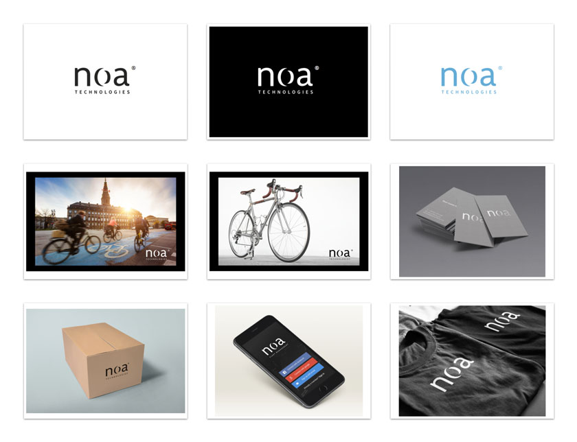
When I joined in mid-2015, the company was suffering from an identity crisis: the company was looking to jettison the Lock8 brand name to reflect the change in focus and the all-new team. I led a number of exercises to define the guiding principles for the the brand, and after the new name — Noa Technologies — was determined, I led the transition with efforts in design, typography and context exploration.

Lock8 to Noa rebranding
Surprisingly, one of the biggest challenges in this design was diminishing the word “No” in the name. My exposure to the conscious dialect of Iyaric English inspired me to attempt to neutralize this by setting the name in lowercase and leveraging closure to creating an extruded effect on the “o” in the center.

Noa brand context explorations
Design & Development
My work at Apple instilled in me the conviction that design is more than the pixels that move around on screen; it’s how something works. I was drawn to the user-facing Rider application because it would be the end users’ primary touchpoint with the company.
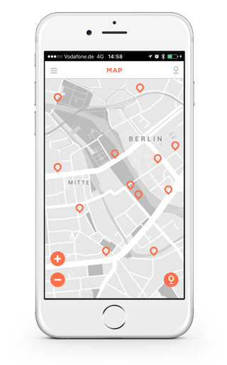
Typically, transportation apps show a map of options near the user (e.g., ZipCar, Car2Go, DriveNow and almost all the bike sharing competitors). Relegating the map to a subservient role — visible only for the selected bike — made for an efficient user experience that was both utilitarian & extensible to multiple simultaneous rentals.

early map-centric design

map / list hybrid design
In addition to the work on the Rider app, I helped architect the Noa SDK, defining key classes relating to search, Bluetooth discovery & connection and other concepts used throughout the SDK. The Noa SDK forms the backbone for Noa’s iOS applications and will be the company’s primary offering to third parties wishing to integrate Noa hardware with existing fleet assets.